Va.LabelField — 라벨만 있는 Field (내부 필드 없음)
입력 컴포넌트 없이 폼 라벨 영역만 가진 Field입니다. Field 계열 중 가장 단순한 클래스로, Va.Field 베이스가 만들어주는 라벨 영역 + 검증 영역만 있고 내부 fieldComponent(Input/Combobox 등)는 없습니다. 사용자가 자식으로 자유롭게 컴포넌트를 담을 수 있는 "빈 필드 컨테이너".
- 클래스: Va.LabelField — va_component.js:5351
- short name: labelField
- 상속: Va.Field (다른 Field 형제들과 같음)
- 내부 컴포넌트: 없음 (다른 Field는 모두 있음)
- isContainer: true
- 베이스 CSS: va-field
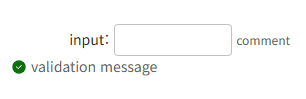
1. 기본 사용
{
    tagName: 'labelField',
    label: '상태',
    tags: [
        { tagName: 'div', innerHTML: '<span style="color:green">정상</span>' }
    ]
}
라벨은 폼 규격대로 나오고, 필드 영역에는 사용자가 배치한 임의의 콘텐츠가 표시됩니다.
2. Va.LabelField의 정체
전체 코드가 23줄뿐인 극도로 단순한 클래스입니다. 특별한 로직 없이 Va.Field를 그대로 상속하고, fieldDivElement를 컨테이너로 노출만 합니다.
Va.LabelField = class extends Va.Field {
    constructor(option){
        super(option);
        // ... 최소 세팅
        this.containerElement = this.fieldDivElement;   // ← 핵심 한 줄
    }
}
핵심: containerElement가 fieldDivElement — 즉, tags: [...]로 넘긴 자식이 이 영역에 배치됩니다.
3. 다른 Field / LabelField의 차이
항목일반 Field (InputField 등)Va.LabelFieldVa.Label (단독)
| 폼 라벨 | ✓ | ✓ | ✓ (자체) |
| fieldComponent 소유 | ✓ (Input, Combobox 등) | ✕ (없음) | ✕ |
| 검증 메시지 영역 | ✓ | ✓ | ✕ |
| 필수 표시 | ✓ | ✓ | ✓ |
| info 툴팁 | ✓ | ✓ | ✓ |
| 사용자 자식 담기 | ✕ (fieldComponent만) | ✓ (자유) | ✕ |
| 폼 정렬 시각 규격 | ✓ | ✓ | ✕ (자체 규격) |
한 줄 요약: "라벨 규격은 폼 필드와 통일하면서, 필드 영역에 뭐든 자유롭게 담을 수 있는 컴포넌트."
4. 주요 속성
Field 상속 (전체 활용)
속성설명
| label | 폼 라벨 |
| labelPosition | top / bottom / left / right |
| labelWidth | 라벨 폭 |
| noLabel | 폼 라벨 숨김 |
| infoButton | info 아이콘 |
| required | 필수 표시 |
| disabled | 비활성화 스타일 |
| size | 크기 |
| commentText | 라벨 옆 설명 텍스트 |
검증
속성설명
| validation | {state, size, message} |
| validationState | success / warning / error |
| validationMessage | 메시지 |
LabelField 전용
없음 — 자체 properties 확장 없음. Field의 모든 속성 그대로.
5. 자식 컴포넌트 담기 — tags
일반 Field 형제와 달리 tags 배열로 자식을 자유롭게 담을 수 있음:
{
    tagName: 'labelField',
    label: '연락처',
    tags: [
        { tagName: 'input', style: { width: '80px' } },
        { tagName: 'span', innerHTML: '-' },
        { tagName: 'input', style: { width: '100px' } },
        { tagName: 'span', innerHTML: '-' },
        { tagName: 'input', style: { width: '100px' } }
    ]
}
이렇게 여러 요소를 조합해 커스텀 필드 UI를 만들되, 라벨 정렬은 다른 필드와 규격 통일.
6. 이벤트
Field 상속. 자체 추가 이벤트 없음. 자식 컴포넌트의 이벤트를 사용하면 됩니다.
7. 메서드 (Field 상속)
메서드설명
| setLabel(label) | 라벨 변경 |
| setSize(size) | 크기 |
| setDisabled(bool) / setReadOnly(bool) | 상태 |
| setValidation(state, message) | 검증 표시 |
| clearValidation() | 검증 해제 |
주의: getValue() / setValue()는 Field 상속이지만 fieldComponent가 없어서 실질 활용 제한적. 값 관리는 자식 컴포넌트가 각자.
8. 내부 구조
<div elname="element" class="va-field [vertical|horizontal]" field="true">
  <div elname="inner" class="field-inner">
    <div elname="labelDiv" class="label-div">
      <label cpname="label">연락처 <span class="required">*</span></label>
    </div>
    <div elname="comment" class="field-comment"></div>
    <div elname="fieldDiv" class="field-div">
      <!-- 사용자가 tags로 배치한 자식 컴포넌트들 -->
      <input>
      <span>-</span>
      <input>
    </div>
  </div>
  <div elname="validationDiv" style="display:none">
    <div class="va-validation">...</div>
  </div>
</div>
핵심: fieldDivElement(= field-div)가 컨테이너 역할. tags로 넘긴 것들이 여기 렌더됩니다.
9. 언제 쓰나
LabelField가 맞을 때
- 커스텀 필드 조합 (전화번호, 계좌번호 등 여러 input 조합)
- 읽기 전용 정보에 라벨 (계산 결과, 아이콘 + 텍스트 등)
- 다른 폼 필드와 규격 통일이 필요한 커스텀 UI
- 버튼 그룹 등을 폼 필드처럼 배치
- 표준 Field가 커버하지 못하는 UI
다른 걸 쓸 때
- 라벨 없이 커스텀 그룹 → Va.Div + Va.Label 조합
- 편집 가능한 필드 → Va.InputField 등 표준 Field
- 읽기 전용 값 → Va.DisplayField
- 폼 밖 라벨만 → Va.Label
10. 흔한 조합 예시
// 커스텀 전화번호 (3분할)
{
    tagName: 'labelField',
    label: '연락처',
    required: true,
    tags: [
        {
            tagName: 'div',
            layout: 'ds-flex fd-row ai-center gap-xs',
            tags: [
                { tagName: 'input', style: { width: '60px' } },
                { tagName: 'span', innerHTML: '-' },
                { tagName: 'input', style: { width: '80px' } },
                { tagName: 'span', innerHTML: '-' },
                { tagName: 'input', style: { width: '80px' } }
            ]
        }
    ]
}

// 값 + 액션 버튼
{
    tagName: 'labelField',
    label: '인증번호',
    tags: [
        {
            tagName: 'div',
            layout: 'ds-flex fd-row gap-s',
            tags: [
                { tagName: 'input', style: { flex: 1 } },
                { tagName: 'button', text: '확인' }
            ]
        }
    ]
}

// 아이콘 + 상태 텍스트
{
    tagName: 'labelField',
    label: '연결 상태',
    tags: [
        {
            tagName: 'div',
            layout: 'ds-flex fd-row ai-center gap-xs',
            tags: [
                { tagName: 'i', class: 'ico_check_circle', style: { color: 'green' } },
                { tagName: 'span', innerHTML: '정상 연결됨' }
            ]
        }
    ]
}

// 좌측 라벨 (조회 화면)
{
    tagName: 'labelField',
    label: '옵션',
    labelPosition: 'left',
    labelWidth: 100,
    tags: [
        { tagName: 'checkbox', checkboxLabel: '자동 갱신' },
        { tagName: 'checkbox', checkboxLabel: '알림 받기' }
    ]
}

// info 툴팁 + 여러 값
{
    tagName: 'labelField',
    label: '수수료',
    infoButton: { tooltip: '월 수수료와 거래 수수료 합계' },
    tags: [
        { tagName: 'span', innerHTML: '월 5,000원 + 건당 100원' }
    ]
}
11. 실전 예 — 인증 프로세스 폼
class VerifyForm extends Va.View {
    onSendCode(btn, el, evt) {
        const phone = this.getRef('phone').getValue();
        if (!phone) {
            new Va.Alert({ title: '알림', message: '전화번호를 입력하세요' }).show(this);
            return;
        }
        AuthService.sendCode(this, { phone });
    }

    onVerify(btn, el, evt) {
        const code = this.getRef('code').getValue();
        AuthService.verify(this, { code }, (view, ok) => {
            if (ok) {
                // 인증 성공 → 라벨 필드의 상태 표시 갱신
                view.getRef('statusDiv').innerHTML =
                    '<i class="ico_check_circle" style="color:green"></i> 인증 완료';
            }
        });
    }

    config() {
        return {
            tagName: 'page',
            tags: [{
                tagName: 'panel',
                tags: [
                    { tagName: 'h2', innerHTML: '휴대폰 인증' },

                    // 전화번호 + 발송 버튼 (커스텀 필드)
                    {
                        tagName: 'labelField',
                        label: '전화번호',
                        labelPosition: 'left',
                        labelWidth: 100,
                        required: true,
                        tags: [{
                            tagName: 'div',
                            layout: 'ds-flex fd-row gap-s',
                            tags: [
                                { tagName: 'input', ref: 'phone', style: { flex: 1 } },
                                { tagName: 'button', text: '발송', onClick: 'onSendCode' }
                            ]
                        }]
                    },

                    // 인증번호 + 확인 버튼
                    {
                        tagName: 'labelField',
                        label: '인증번호',
                        labelPosition: 'left',
                        labelWidth: 100,
                        required: true,
                        tags: [{
                            tagName: 'div',
                            layout: 'ds-flex fd-row gap-s',
                            tags: [
                                { tagName: 'input', ref: 'code', style: { flex: 1 } },
                                { tagName: 'button', text: '확인', onClick: 'onVerify' }
                            ]
                        }]
                    },

                    // 상태 표시 (읽기 전용, 라벨과 규격 통일)
                    {
                        tagName: 'labelField',
                        label: '상태',
                        labelPosition: 'left',
                        labelWidth: 100,
                        tags: [{
                            tagName: 'div',
                            ref: 'statusDiv',
                            innerHTML: '인증 대기 중...'
                        }]
                    }
                ]
            }]
        };
    }
}
핵심: 세 필드 모두 동일한 라벨 폭·정렬로 통일. 각 필드의 콘텐츠는 자유롭게(input+버튼 조합, div 등).
12. 알아두면 좋을 주의사항
- fieldComponent 없음 — 다른 Field 형제와 달리 내부 입력 컴포넌트가 없음.
- containerElement가 fieldDivElement — tags 자식이 여기 렌더됨.
- getValue()/setValue() 실효 제한적 — 값 관리는 자식 컴포넌트가 각자.
- 자체 이벤트·메서드 확장 없음 — Field 그대로 상속. 최소한의 클래스.
- update()도 매우 단순 — super.update() + updateStyles/_commitClass만.
- 폼 규격 통일이 핵심 가치 — 라벨 정렬·검증 영역이 다른 Field와 동일.
- 자식 컴포넌트의 값은 개별 조회 — getRef()로 각 자식에 접근.
- 검증 메시지는 활용 가능 — setValidation() / clearValidation()으로 필드 하단 메시지 표시.
- labelPosition, labelAlign 등 Field의 라벨 옵션 그대로 — 다른 Field와 동일한 배치 옵션.
- Va.Label과 혼동 주의 — Label은 텍스트 라벨 자체, LabelField는 Field 컨테이너.
13. labelField vs label vs 일반 Field 선택
상황추천
| 폼 라벨 규격으로 커스텀 필드 | labelField |
| 여러 컴포넌트 조합 (전화번호 등) | labelField |
| 표준 입력 필드 | inputField / comboboxField 등 |
| 읽기 전용 값 표시 | displayField |
| 라벨 텍스트만 필요 | label |
| 폼 규격 없는 커스텀 그룹 | div + label 조합 |
"표준 Field로 커버 안 되는 커스텀 UI가 폼 규격을 유지해야 하면 labelField" — 명확한 사용처.
참고
- API 문서 페이지: https://vanillafront.com/docs.html?theme=light#main#apilabelfield
- 연관: Va.Field(부모, 로직 대부분 제공), Va.Label(라벨 텍스트 자체)
'컴포넌트 > 필드 컴포넌트' 카테고리의 다른 글
| Label (라벨) (0) | 2026.09.14 |
|---|---|
| DisplayField (디스플레이 필드) (0) | 2026.09.14 |
| Display (디스플레이) (0) | 2026.09.14 |
| FileDropUploadField (파일드롭 업로드 필드) (0) | 2026.09.14 |
| FileDropUpload (파일드롭 업로드) (0) | 2026.09.14 |