컴포넌트/툴바
Toolbar (툴바)
VanillaFront
2026. 9. 20. 16:31
Va.Toolbar — 오버플로우 스크롤 지원 툴바 컨테이너
여러 버튼/컴포넌트를 나란히 배치하되, 폭/높이가 부족하면 자동으로 좌우(또는 상하) 스크롤 버튼이 나타나는 툴바입니다. Va.Div를 상속하며 반응형 툴바 UX를 내장합니다.
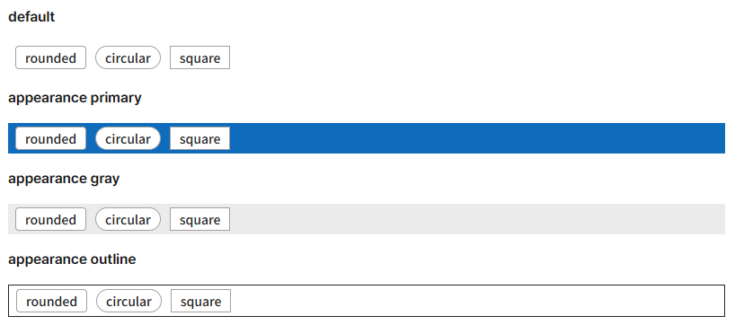
클래스 정보
Va.Toolbar extends Va.Div extends Va.Component
tagName: 'toolbar' (실제 렌더링은 <div>)
isContainer: true
기본 사용법
{
    tagName: 'toolbar',
    direction: 'horizontal',
    tags: [
        { tagName: 'button', text: '조회', icon: 'ico_search' },
        { tagName: 'button', text: '추가', icon: 'ico_add' },
        { tagName: 'button', text: '삭제', icon: 'ico_delete_fill' },
        { tagName: 'button', text: '엑셀', icon: 'ico_download' },
        { tagName: 'button', text: '인쇄', icon: 'ico_print' }
    ]
}
ActionBar와의 결정적 차이
항목Va.ActionBarVa.Toolbar
| 성격 | 얇은 flex 컨테이너 | 오버플로우 스크롤 자동 처리 |
| 폭 부족 시 | 자식이 잘림/줄바꿈 | 좌우 화살표 버튼 자동 표시 |
| 방향 | horizontal 위주 | horizontal/vertical 모두 지원 |
| 정렬 옵션 | 없음 (직접 spacer) | align: 'center' | 'end' 내장 |
| 컨트롤 버튼 | 없음 | 자동 ← → 버튼 |
| 파일 크기 | 매우 얇음 | 로직 있음 (~200줄) |
요약:
- 자식이 늘 화면에 들어가는 확실한 상황 → Va.ActionBar
- 자식 수가 유동적이거나 반응형 화면 → Va.Toolbar
속성
속성타입기본값설명
| direction | String | 'horizontal' | 'horizontal' 또는 'vertical' |
| align | String | (start) | 'center', 'end' — 자식 정렬 |
| controlButtonAppearance | String | 'transparent' | 스크롤 버튼 외형 |
| hideControlButton | Boolean | false | 컨트롤 버튼 강제 숨김 |
| itemMaxSize | Number | 200(h)/40(v) | 아이템 최대 크기 |
| popWidth | Number | 200 | (내부용) |
| stopPropagation | Boolean | true | 이벤트 전파 차단 |
| appearance | String | — | 툴바 외형 (primary 등) |
자동 스크롤 동작
horizontal 방향:
- 자식들이 폭보다 크면 오른쪽에 → 버튼 자동 표시
- → 클릭 시 내용이 왼쪽으로 밀림
- 왼쪽으로 밀리면 왼쪽에 ← 버튼 표시
- 처음/끝에 도달하면 해당 버튼 자동 숨김
vertical 방향:
- 상하 방향으로 동일 로직 (↑↓ 버튼)
ResizeObserver로 폭 변경 감지 (200ms 디바운스):
- 창 크기 조정 시 자동으로 컨트롤 버튼 표시/숨김 재계산
이벤트
Va.Div로부터 상속:
- click — 클릭 시
- contextmenu — 우클릭 시
메서드
- Va.Div / Va.Component 공통 메서드
- 스크롤 제어는 내부 컨트롤 버튼 자동 처리 (별도 API 불필요)
내부 구조
<div class="va-toolbar horizontal">
    <div class="toolbar-inner" elname="inner">
        <div class="toolbar-inner-content" elname="innerContent">
            <div elname="startBlank" style="flex:1"></div>   <!-- align center/end 시 -->
            <div class="content" elname="content">
                <!-- containerElement — 자식 버튼들 -->
                <button>조회</button>
                <button>추가</button>
                ...
            </div>
            <div elname="blank" style="flex:1"></div>
        </div>
        <button cpname="startButton"><!-- ← 스크롤 --></button>
        <button cpname="endButton"><!-- → 스크롤 --></button>
    </div>
</div>
사용 시점 — 언제 쓰나
- 버튼이 많은 툴바 — 5~20개 액션 버튼, 화면 크기에 따라 잘릴 위험
- 탭 스타일 툴바 — 항목 많은 카테고리 스위치
- 반응형 화면 — 데스크톱/태블릿/모바일 모두 대응
- 세로 사이드 툴바 — direction: 'vertical'
- 다국어 UI — 언어별로 텍스트 길이 달라 잘릴 위험 있을 때
사용하지 말아야 할 때
- 자식 개수 확정, 잘릴 일 없음 → Va.ActionBar (더 얇음)
- 제목 + 액션 조합 → Va.TitleBar
- 일반 flex 정렬 → Va.Div + layout
- 탭 인터페이스 (콘텐츠 전환) → Va.Tab (Toolbar는 순수 버튼 나열)
자주 쓰는 조합 예시
기본 가로 툴바 (많은 버튼)
{
    tagName: 'toolbar',
    tags: [
        { tagName: 'button', text: '조회', icon: 'ico_search' },
        { tagName: 'button', text: '추가', icon: 'ico_add' },
        { tagName: 'button', text: '편집', icon: 'ico_pen_fill' },
        { tagName: 'button', text: '삭제', icon: 'ico_delete_fill' },
        { tagName: 'button', text: '엑셀', icon: 'ico_download' },
        { tagName: 'button', text: 'PDF', icon: 'ico_document' },
        { tagName: 'button', text: '인쇄', icon: 'ico_print' },
        { tagName: 'button', text: '이메일', icon: 'ico_mail' },
        { tagName: 'button', text: '공유', icon: 'ico_share' }
        // 화면 좁으면 자동으로 → 버튼으로 스크롤 가능
    ]
}
세로 사이드 툴바
{
    tagName: 'toolbar',
    direction: 'vertical',
    style: { height: '400px', width: '60px' },
    tags: [
        { tagName: 'button', iconOnly: true, icon: 'ico_home' },
        { tagName: 'button', iconOnly: true, icon: 'ico_search' },
        { tagName: 'button', iconOnly: true, icon: 'ico_settings' },
        { tagName: 'button', iconOnly: true, icon: 'ico_profile' },
        { tagName: 'button', iconOnly: true, icon: 'ico_notification' }
    ]
}
중앙 정렬
{
    tagName: 'toolbar',
    align: 'center',
    tags: [
        { tagName: 'button', text: '이전' },
        { tagName: 'button', text: '재생', appearance: 'primary' },
        { tagName: 'button', text: '다음' }
    ]
}
우측 정렬
{
    tagName: 'toolbar',
    align: 'end',
    tags: [
        { tagName: 'button', text: '취소' },
        { tagName: 'button', text: '저장', appearance: 'primary' }
    ]
}
컨트롤 버튼 강제 숨김 (스크롤 필요 없음 확신 시)
{
    tagName: 'toolbar',
    hideControlButton: true,
    tags: [ /* 짧은 목록 */ ]
}
Primary 외형
{
    tagName: 'toolbar',
    appearance: 'primary',
    style: { padding: '10px', borderRadius: 'var(--sizeRadiusM)' },
    tags: [
        { tagName: 'button', text: '저장', appearance: 'primary' },
        { tagName: 'button', text: '전송', appearance: 'primary' }
    ]
}
혼합 컴포넌트 툴바
{
    tagName: 'toolbar',
    tags: [
        { tagName: 'inputField', label: '검색', ref: 'refKeyword' },
        { tagName: 'button', text: '조회', appearance: 'primary' },
        { tagName: 'combobox', items: [ /* 필터 옵션 */ ] },
        { tagName: 'button', text: '새로고침', icon: 'ico_refresh' }
    ]
}
실전 예시 — 문서 편집기 툴바
config(){
    return {
        tagName: 'page',
        tags: [{
            tagName: 'toolbar',
            style: {
                padding: '5px',
                borderBottom: '1px solid var(--colorNeutralStroke)'
            },
            tags: [
                { tagName: 'button', iconOnly: true, icon: 'ico_bold', onClick: 'onClickBold' },
                { tagName: 'button', iconOnly: true, icon: 'ico_italic', onClick: 'onClickItalic' },
                { tagName: 'button', iconOnly: true, icon: 'ico_underline', onClick: 'onClickUnderline' },
                { tagName: 'div', style: { width: '1px', background: 'var(--colorNeutralStroke)', margin: '0 5px' } },
                { tagName: 'button', iconOnly: true, icon: 'ico_align_left', onClick: 'onClickAlignLeft' },
                { tagName: 'button', iconOnly: true, icon: 'ico_align_center', onClick: 'onClickAlignCenter' },
                { tagName: 'button', iconOnly: true, icon: 'ico_align_right', onClick: 'onClickAlignRight' },
                { tagName: 'div', style: { width: '1px', background: 'var(--colorNeutralStroke)', margin: '0 5px' } },
                { tagName: 'button', iconOnly: true, icon: 'ico_link', onClick: 'onClickLink' },
                { tagName: 'button', iconOnly: true, icon: 'ico_image', onClick: 'onClickImage' },
                { tagName: 'button', iconOnly: true, icon: 'ico_table', onClick: 'onClickTable' }
                // 화면 좁으면 자동 스크롤
            ]
        },{
            tagName: 'section',
            style: { flex: 1 },
            tags: [ /* 편집 영역 */ ]
        }]
    };
}
주의사항
- 컨트롤 버튼 자동 표시 — 자식이 폭을 넘으면 자동으로 ← → 버튼 표시. 예상 못한 UX면 hideControlButton: true
- ResizeObserver 200ms 디바운스 — 창 크기 변경 시 약간의 지연 후 재계산
- direction: 'vertical' 사용 시 크기 명시 필수 — height를 style로 지정 안 하면 컨트롤 버튼 표시 로직 오동작
- align: 'start'(기본) — startBlank는 숨김 상태. 'center'/'end'일 때만 활성
- itemMaxSize 자동 결정 — direction에 따라 200 or 40. 명시 안 하면 기본값 사용
- appearance primary 사용 시 아이콘 색상 자동 변경 — menuIconBackgroundColor 처리
- Va.Div 상속 — Div의 gridHeader/gridBody 등 사용 가능
- 컨트롤 버튼 자체는 자식으로 취급 안 됨 — startButton/endButton은 innerComponents에 등록되어 자동 관리
- 모바일 터치 스크롤은 안 됨 — 컨트롤 버튼으로만 스크롤. 모바일 UX면 ScrollView 등 별도 검토
Toolbar vs ActionBar vs TitleBar 비교
항목ToolbarActionBarTitleBar
| 오버플로우 자동 스크롤 | ✅ | ❌ | ❌ |
| 방향 (h/v) | 모두 | 대개 h | 대개 h |
| 정렬 옵션 내장 | ✅ | ❌ | ❌ |
| 제목 결합 | ❌ | ❌ | ✅ (Title 자식) |
| 파일 크기 | 크다 | 얇다 | 얇다 |
| 주 용도 | 버튼 많은 툴바 | 폼 하단 액션 | 제목+액션 조합 |
대안 비교
상황추천
| 버튼 많고 반응형 필요 | Va.Toolbar |
| 확정된 몇 개 액션 버튼 | Va.ActionBar |
| 제목 + 액션 조합 | Va.TitleBar |
| 탭 인터페이스 (콘텐츠 전환) | Va.Tab |
| 순수 그루핑 | Va.Div |
참고
- API 문서 페이지: https://vanillafront.com/docs.html?theme=light#main#apitoolbar
- 연관: Va.Div(부모), Va.ActionBar(단순 대안)