CompoundButton (복합버튼)
Va.CompoundButton — 두 줄짜리 복합 버튼
일반 Va.Button이 한 줄 라벨을 가진 버튼이라면, Va.CompoundButton은 주 텍스트(primary) + 부가 설명(secondary)을 한 버튼에 담는 두 줄 구조입니다. "저장 / 변경사항 5건", "결제 / VISA •••1234"처럼 라벨과 컨텍스트를 함께 보여줘야 하는 상황에 씁니다.
- 클래스: Va.CompoundButton — va_component.js:12975
- short name: compoundButton
- 상속: Va.Component (Button과 형제 관계, Va.Button을 상속하진 않음)
- 베이스 CSS: va-button (일반 버튼과 스타일 계보 공유)
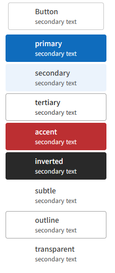
1. 기본 사용
{
    tagName: 'compoundButton',
    text: 'Primary Text',
    secondaryContent: 'secondary text'
}
text가 주 라벨(굵게 표시), secondaryContent가 그 아래 부가 텍스트로 렌더됩니다.
2. Va.Button과의 차이
항목Va.ButtonVa.CompoundButton
| 라벨 구조 | 텍스트 1개 (text) | primary + secondary 2단 |
| 전용 속성 | — | secondaryContent |
| 클래스 계층 | Component 직속 | Component 직속 (Button 상속 아님) |
| 이벤트 | click / iconClick / contextmenu / focus / blur / mousedown | click / contextmenu / focus / blur |
| iconClick 이벤트 | 있음 (아이콘만 별도 클릭 감지) | 없음 |
| iconRotate / 색상 커스텀 | 있음 | 없음 |
| actived / pressed 상태 | 있음 | 없음 — selected (select/unselect) 만 존재 |
| 내부 elname | element/inner/icon/text | element/inner/icon/content/primaryContent/secondaryContent |
즉, CompoundButton은 "두 줄 라벨"을 얻는 대신 인터랙션 다양성 일부를 포기한 형태입니다. 단순 액션 트리거보다는 정보성 버튼에 초점.
3. 속성
속성타입설명
| text | string | 주 라벨 (primaryContent에 렌더) |
| innerHTML | string | HTML 주 라벨. _sanitize 적용 |
| secondaryContent | string | 부가 라벨 (secondaryContent에 렌더) |
| icon | string | 아이콘 클래스 (예: ico_emoji_fill) |
| iconPosition | 'left'|'right'|'top'|'bottom' | 아이콘 위치. top/bottom이면 column 레이아웃 |
| iconOnly | boolean | 텍스트 숨김 (본래 취지엔 잘 안 맞지만 지원됨) |
| iconSize | string | 아이콘 크기 |
| textAlign | 'left'|'center'|'right' | 정렬 |
| appearance | 9종 | 시각 스타일 |
| shape | 'rounded'|'circular'|'square' | 모서리 형태 |
| size | 'xsmall'~'xlarge' | 크기 5단계 |
| disabled | boolean | 비활성화 |
| badge | object | 배지 옵션 (Button과 동일 규약) |
| stopPropagation | boolean (기본 true) | 이벤트 버블링 차단 |
appearance 9종 (Button보다 2개 적음)
default · primary · secondary · tertiary · accent · inverted · subtle · outline · transparent
Button에 있던 text / underline appearance는 CompoundButton에는 없습니다 — 두 줄 구조와 어울리지 않아서 제외된 것으로 보입니다.
4. 이벤트
이벤트발생 시점
| click | 클릭 |
| contextmenu | 우클릭 |
| focus / blur | 포커스 진입/이탈 |
Button의 iconClick 같은 세분화된 이벤트는 없습니다. 아이콘을 눌러도 click 하나로 통합.
5. 메서드
메서드설명
| setText(text) | 주 텍스트 변경 |
| setInnerHTML(html) | HTML 주 텍스트 변경 |
| setSecondaryContent(content) | 부가 텍스트 변경 (CompoundButton 전용) |
| setIcon(icon) | 아이콘 변경 |
| setAppearance(v) / setShape(v) / setSize(v) | 시각 속성 변경 |
| setDisabled(bool) | 비활성화 |
| select() / unselect() | 선택 상태 토글 (Button의 active/inactive와 유사) |
| focus() / blur() | 포커스 제어 |
실제 사용례 → DemoCompoundButtons.js:23-33
6. 내부 구조
<button elname="element" tabindex="0" class="va-button">
  <span elname="inner" class="compound-button-inner">
    <span elname="icon" class="icon compound ico_xxx left">…</span>   ← icon 지정 시
    <span elname="content" class="content">
      <span elname="primaryContent" class="primary-content">주 라벨</span>
      <span elname="secondaryContent" class="secondary-content">부가 라벨</span>
    </span>
    <span cpname="badge" class="va-badge">…</span>                     ← badge 지정 시
  </span>
</button>
핵심은 content span 안에 primary/secondary 두 개를 세로로 쌓아 CSS로 자연스러운 두 줄 레이아웃을 만든다는 점입니다. 아이콘은 그 바깥, inner span 안에서 좌/우/상/하로 배치됩니다.
7. Badge 결합 예시
Button과 동일하게 badge 옵션 하나로 결합합니다.
{
    tagName: 'compoundButton',
    text: '알림',
    secondaryContent: '읽지 않음 12건',
    icon: 'ico_bell',
    badge: {
        size: 'medium',
        innerHTML: '12',
        color: 'primary'
    }
}
8. 언제 쓰나 — 판단 기준
CompoundButton을 쓸 때
- 버튼에 라벨만으로 부족한 컨텍스트가 필요할 때 ("결제 / 5,000원", "다음 단계 / 배송 정보 입력")
- 카드형 액션 (설정 항목, 계정 선택, 결제 수단 선택 등)
- 라벨과 부연 설명을 한 요소로 묶고 싶을 때
그냥 Button을 쓸 때
- 짧은 액션 트리거 (저장/취소/확인)
- 툴바·아이콘 버튼
- 아이콘 클릭과 본체 클릭을 구분해야 할 때 (iconClick 필요)